Posts Tagged: interior paint colors

Farrow and Ball Clunch

Farrow and Ball Clunch

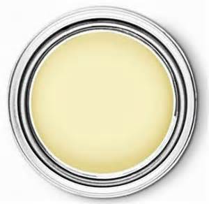
Okay.  We know it’s hard to get excited about off white paint, especially when it’s called “Clunch.”  We want to change that.  This is a beautiful, verasatile shade and works really well in your collection.  Inspired by the chalk tones of the buildings in East Anglia, England, this shade gives your sleek portfolio richness and… Read more »

Farrow and Ball Drawing Room Blue

Farrow and Ball Drawing Room Blue

This is strong.  It seems a very dramatic, and possibly daunting color to paint a room.  If you ever get to Chicago, please go to RL Cafe, and see for yourself how well this color works.  It’s a classic and believe us, works perfectly as a backdrop for artwork, bookshelves, white trim.  It’s a keeper… Read more »

Farrow and Ball Wimborne White

This room is so cool.  We wish we could take credit for it.  We’re showing it to you because if the outstanding white paint back drop.  White paint doesn’t have to be boring.  On the contrary, how could anything in your space be anything but fantastic?  Check out Farrow and Ball’s Wimborne White.

Beautiful Red

The eye is always drawn to red.  It evokes power, strength and confidence.  In Russia, Red Square was not named for communism, but because in the Russian language, the word for red also means “beautiful.”  We agree, especially with this beautiful shade by Pratt and Lambert. This color looks beautiful in a Dining Room ,… Read more »

Turning Oakleaf Yellow

A little yellow goes a long way, but we love it. Pittsburgh Paint created this lovely pale yellow that works wonderfully as a soft, neutral color for any room.  Designer, Dee Schlotter, describes it as “soft with a real presence and an optimistic, enlightened vibe.” We agree completely.