Posts Tagged: interior paint

Farrow and Ball Color Calluna

Farrow and Ball Calluna, pale grey paint

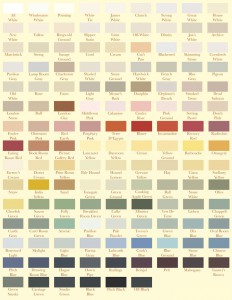
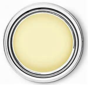
Your collection stands alone.  A parent should never tell a child they are their favorite.. but.  We really like the Modernos.  This  color is as beautiful as the rest of what we’ve built for you.  It has just enough pigment to keep you interested.  We hope you like it.

Farrow and Ball Drawing Room Blue

Farrow and Ball Drawing Room Blue

This is strong.  It seems a very dramatic, and possibly daunting color to paint a room.  If you ever get to Chicago, please go to RL Cafe, and see for yourself how well this color works.  It’s a classic and believe us, works perfectly as a backdrop for artwork, bookshelves, white trim.  It’s a keeper… Read more »

Farrow and Ball James White

White paint.  Kind of hard to get too excited about it.  But we all know it is necessary and artfully applied, can be just the right back drop for a perfectly appointed room. We’ve spent a long time researching  and have found that this shade from Farrow and Ball is true blue.  Consider it the… Read more »

Farrow and Ball Parma Gray

This color reminds of the beautiful blue gray silk Christian Dior used on many of his ball gowns.  Named after the interior designer emeritus, John Fowler, we think this cool tone is pretty spot on for your portfolio.  Obviously, sun exposure, window placement, wood work, has a huge effect on your color palette.  If you… Read more »

Slipper White

A very successful, elegant shade of white.  We’ve seen this shade in lots of applications, and it can pretty much do no wrong.  Ideal for a large space with lots of artwork, a quiet bedroom, it’s a keeper.

Paint SOS

Interior Paint.  It can be stressful.  We know that the right color can bring a room to life while the wrong on can, well, kill it.  There are so many variables that go into choosing the right paint palette for your collection.  We have carefully chosen a couple neutrals  and safe bets to get you… Read more »

Farrow and Ball Vert de Terre

Green is our head color expert’s favorite color.  And even she admits it can be a little tricky.  Avoid using this color in a bathroom or where women will be checking themselves out and applying make-up.  They could look washed-out and over do it.  This lovely, Vert de Terre color from Farrow and Ball is… Read more »

Farrow and Ball Pointing

We know’s it’s hard to get too excited about a very neutral paint color.  It’s kind of like the comfortable brown shoes in your closet.  Not that thrilling, but very necessary and under appreciated.  Voila Pointing from farrow and Ball.  Inspired by the lime mortar used in brick work, it’s a good, rich neutral that… Read more »

Beautiful Red

The eye is always drawn to red.  It evokes power, strength and confidence.  In Russia, Red Square was not named for communism, but because in the Russian language, the word for red also means “beautiful.”  We agree, especially with this beautiful shade by Pratt and Lambert. This color looks beautiful in a Dining Room ,… Read more »

Turning Oakleaf Yellow

A little yellow goes a long way, but we love it. Pittsburgh Paint created this lovely pale yellow that works wonderfully as a soft, neutral color for any room.  Designer, Dee Schlotter, describes it as “soft with a real presence and an optimistic, enlightened vibe.” We agree completely.

Stiffkey Blue

Farrow and Ball developed this color after visiting the beaches in Norfolk in England.  Captured by rich blues from the cockles, mussels and mud, yes, mud can be beautiful, as shown in this color.  It looks amazing against dark woods, black accents and silvery details.

James White

White is not just white.  There are many, many shades of it, and anyone who has stood at the paint chip kiosk knows this can be daunting.  That’s why we’re here!  We’ve tested them.  Our love and fascination for interior paint, some might call a cry for help. One of our designers even collects old… Read more »

Perfect Shade of blue

You might think  it’s hard to get too excited by a paint color, but you should have seen our paint expert’s reaction when she saw this shade of blue.  Kind of like some people when Oprah gives them a new car.  It really is beautiful, soothing, and just enough pigment to be interesting, not obtrusive…. Read more »

Book Room Red

We love the impact of this rich red, without being too much drama.  The perfect statement for smaller rooms.

Charleston Gray

The Bloomsbury group of artists, after whom your collection is named, favored this rich, warm gray in both their unforgettable interiors and groundbreaking canvases.  We like it best painted in a bedroom with an eggshell finish. Dark tones undercoat.

Bloomsbury Group Gray

We’ve seen this colour and it has become a minor obsession.  Yes, there are some brooding dark tones to this dramatic shade, but we think you can handle it.  The Bloomsbury group used a similar shade at their artists’ colony, Charleston in East Sussex, England.