White paint. Kind of hard to get too excited about it. But we all know it is necessary and artfully applied, can be just the right back drop for a perfectly appointed room. We’ve spent a long time researching and have found that this shade from Farrow and Ball is true blue. Consider it the… Read more »
Posts Tagged: paint
Slipper White

A very successful, elegant shade of white. We’ve seen this shade in lots of applications, and it can pretty much do no wrong. Ideal for a large space with lots of artwork, a quiet bedroom, it’s a keeper.
Farrow and Ball Pointing
We know’s it’s hard to get too excited about a very neutral paint color. It’s kind of like the comfortable brown shoes in your closet. Not that thrilling, but very necessary and under appreciated. Voila Pointing from farrow and Ball. Inspired by the lime mortar used in brick work, it’s a good, rich neutral that… Read more »
Charleston Gray

The Bloomsbury group of artists, after whom your collection is named, favored this rich, warm gray in both their unforgettable interiors and groundbreaking canvases. We like it best painted in a bedroom with an eggshell finish. Dark tones undercoat.
Bloomsbury Group Gray

We’ve seen this colour and it has become a minor obsession. Yes, there are some brooding dark tones to this dramatic shade, but we think you can handle it. The Bloomsbury group used a similar shade at their artists’ colony, Charleston in East Sussex, England.
Paint Swatch Artwork
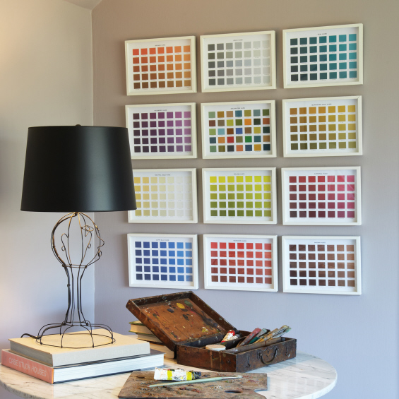
My name is Harvey and I’m addicted to looking at paint chips. So when I found these for the Decorigins collection, I stopped in my tracks and we had to include them. What a strong, confident look. We love the grouping, or each piece stands alone. Heck, go to your hardware store pick up… Read more »